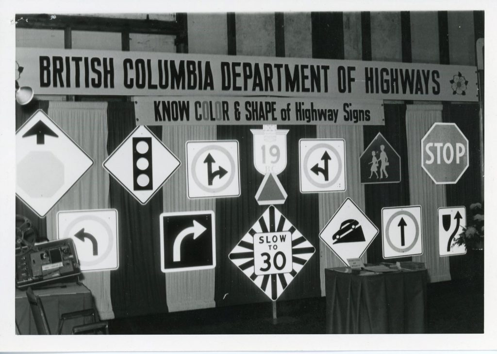
Signage on BC highways is an essential tool to help us communicate information to motorists about the road ahead. Whether a regulatory, warning, or guide sign is called for, we make sure our signs are clear and concise – easy to read and understand at a glance.
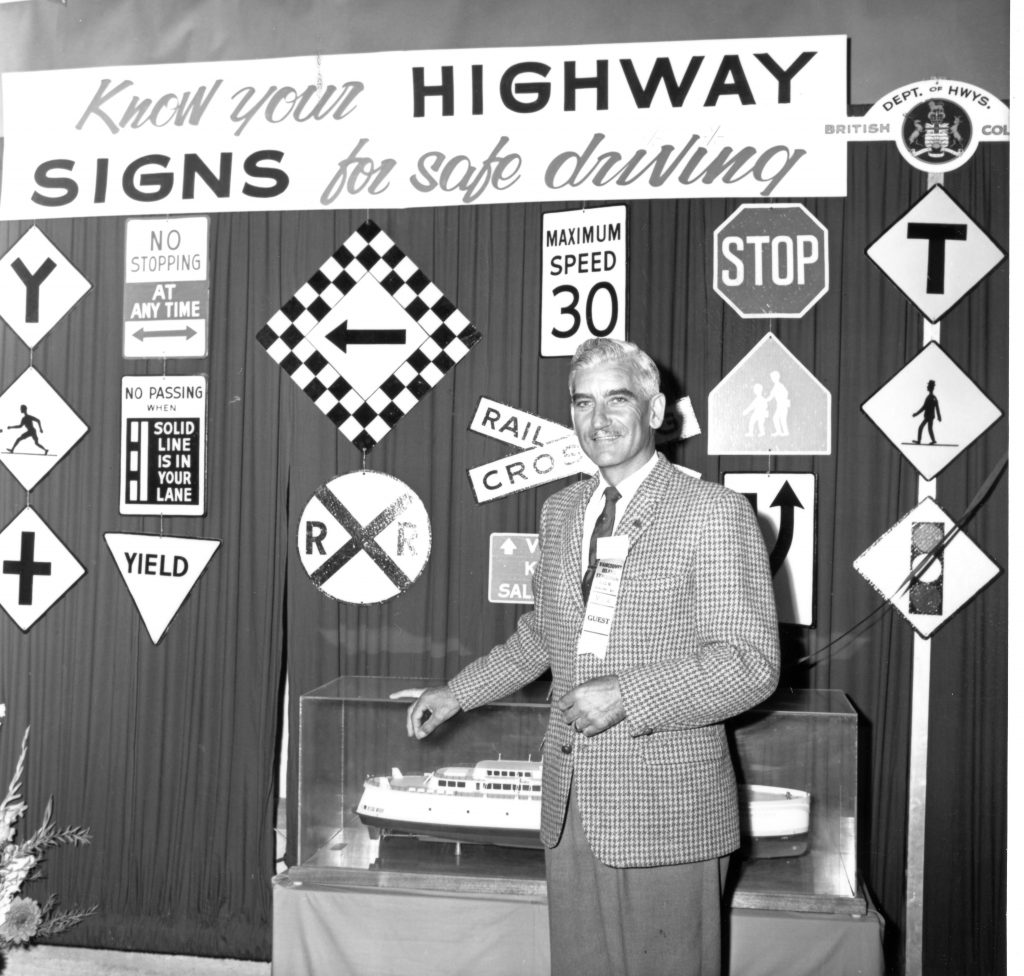
It hasn’t always been this way. In fact, in the early days of motoring, signs on BC highways were irregular, inconsistent and poorly produced. The neglect of highway signage during the war years resulted in a wide range of non-standard signage on BC Highways.
Enter the BC Provincial Sign Shop.
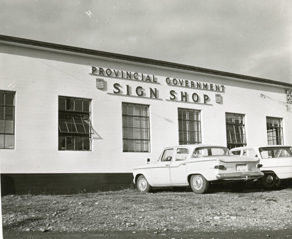
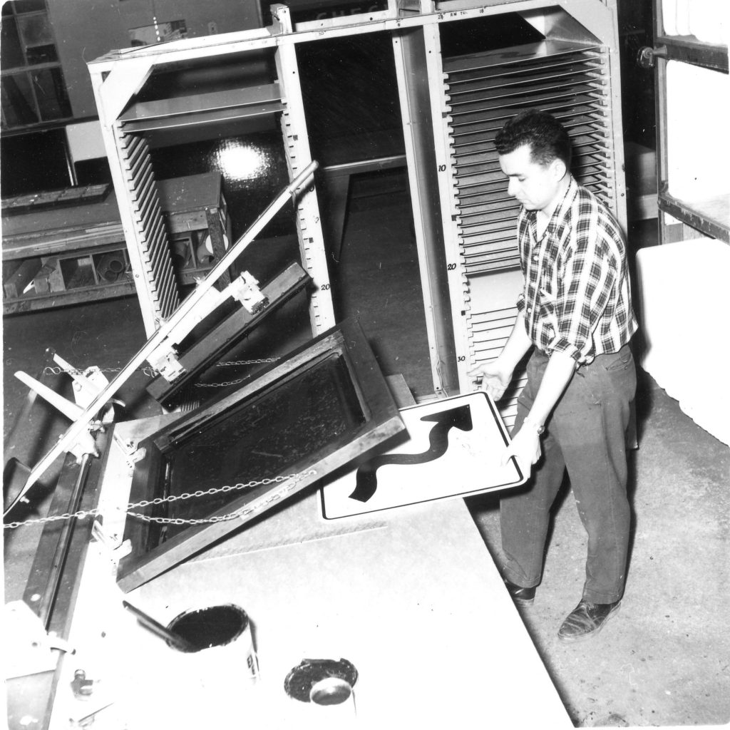
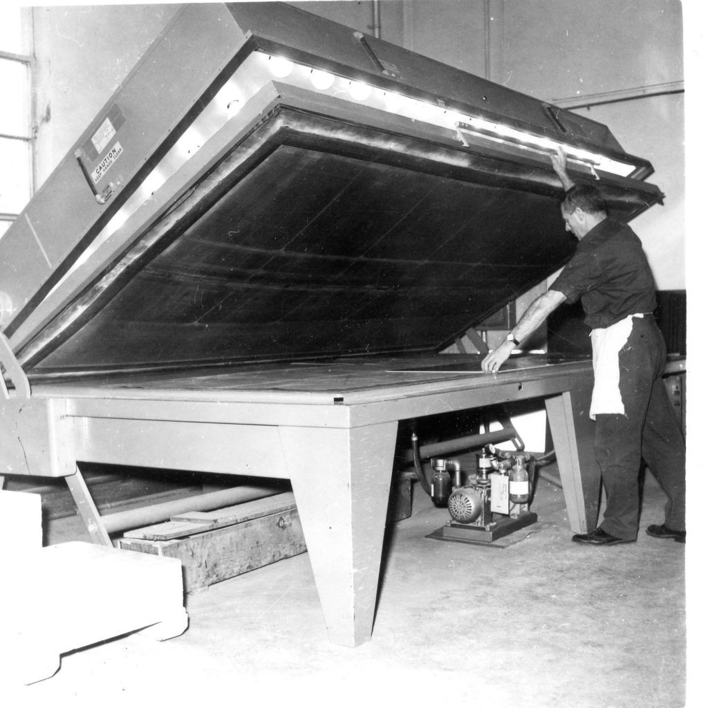
Established in 1949, to ensure that only good quality standard signs be used on BC highways, the sign shop created and produced most of the signage you see today. Back then, normal production included hand-painted and screen-printed signs (today signs are produced in mass volumes, with the assistance of the latest computer technology).
The sign shop provided millions of signs to the Province through a state-of-the-art facility in Langford, until February of 1988 when it was privatized and purchased by its employees.
In 1995, the Provincial Sign Shop returned to the Ministry of Transportation and reopened its doors in Kamloops, with a focus on improving quality assurance, product specifications and product delivery. Following the provincial government’s restructuring, which began in 2001, the Provincial Sign Shop was rebranded as the Provincial Sign Program.
Today the Provincial Sign Program provides design and procurement services for several provincial government ministries as well as airport authorities, BC Ferries and the federal government. Sign manufacturing is now provided outside of government through a competitive bid process. The Provincial Sign Program has been recognized across Canada as a leader in the sign industry by the City of Calgary, the Province of Ontario (on two separate occasions) and the sign shops which produce signs for British Columbia highways.
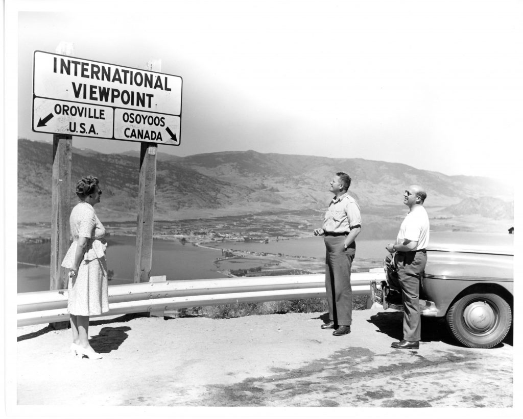
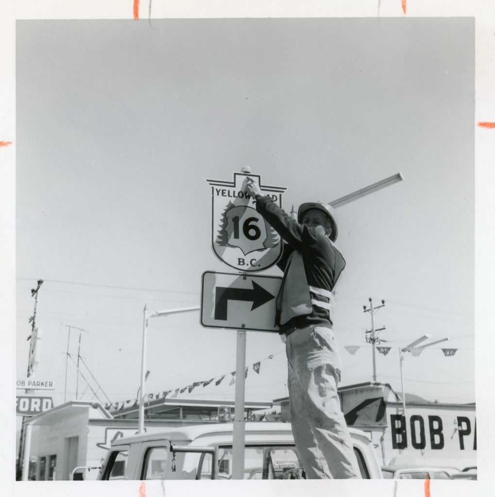
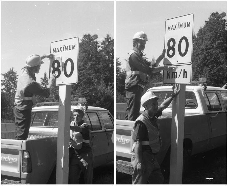
We recently found some old snapshots of the original sign shop and the production of some of those older signs for our highways. Enjoy!
If you’re a fan of our signs, you might find these other stories interesting:
- 7 Types of Traffic Signs on BC Highways
- Left for the Laundromat – BC’s Unusual Highway Signs
- Know When to Slow for Weather with Variable Speed Signs
- Chaos vs. Consistency – Reasons beyond BC Sign Rules
Do you have any questions or comments about this, or anything else we do here at the Ministry of Transportation and Infrastructure? Let us know in the comments below.
I’ve been noticing a lot of changes on the improved roadways in the lower mainland as far as signage clarity and designs go. I’ve also noticed they’re codified, though the changes were made without much event. The simplified highway emblem comes to mind, as well as the oversized signs you see on the Nordel connector now. It’s quite a change of scale to what I’m accustomed to see on BC highways.
Do you ever sell any surplus signs? e.g. Trans-Canada Hwy, numbered highway?
Hello Mike and thanks for your message. There are a number of recognized sign suppliers whom you can contact to order signs.
Here is a list of websites:
http://www.transign.com/
http://www.astrographic.com/
http://www.valleytraffic.ca/
http://www.atstraffic.ca/
Hope this is helpful!
any luck with this Mike?
When did wildlife signs (watch for deer, 20 kms) become common along BC highways?
Hello Ben! Good to hear from you. 🙂 We have sent your question to our environmental management team and will let you know what we hear back.
Hello Ben,
Our apologies for the delay on this response. We adopted these signs (in one form or another) after we adopted the American MUTCD in the late 1940s. Hope this information is helpful and that you are doing well. 🙂
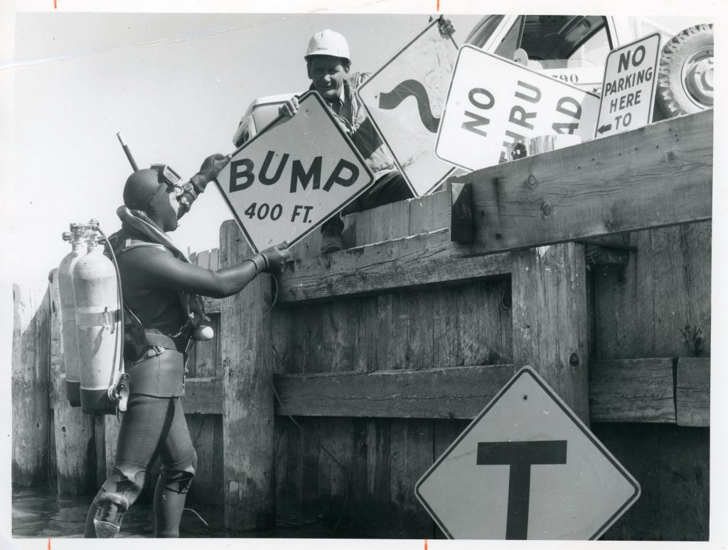
I love that “BUMP” sign.
So do we. 🙂
What type of font design is on the older route signs?
Great question Benjamin. We’ve asked our experts and will let you know what we hear back.
Do you have a picture of the 1960’s road painted signs saying ” Keep BC Green Use Your Ashtray? Back in the WAC Bennet and Phil Gaglardi days.
Hi there Nick – we do! Actually, it’s a gif taken from our Road Trip Time Machine series. We’d be happy to share it with you via email – if you like? Is the email you’ve used here okay for sending?
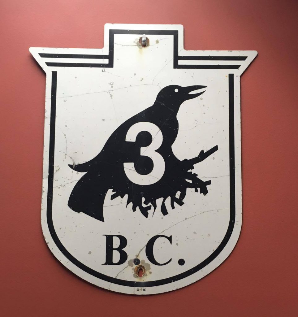
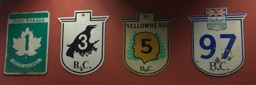
Would you happen to know if the special bird silhouette symbol used on the Crowsnest Highway marker signs is still under copyright? Because if it has fallen out of copyright, I would like to be able to add it to our Wikimedia Commons project.
Good morning, David.
All route marker sign designs including the Crowsnest route marker sign design are owned by the Province of British Columbia and are not approved for use (whole or in part) in the public domain or as freely licensed educational media content.
Thanks for checking with us here – we appreciate it.
Then we will not be adding it to Wikimedia Commons. Thank you for your clarification.
Thank you!
I have always found it fascinating that BC never uses the standard FHWA typeface for their route numbers. Would anyone have an explanation as to why? I reckon BC and New Brunswick are the only jurisdictions in all of North America that don’t use an FHWA/MUTCD standard or variety thereof statewide as adopted in 1948 (most notably Pennsylvania).
Hello Mac – thanks for your comment. We shared it with our traffic engineers and sign shop folks to get the skinny and here’s what they let us know.
The presentation of typography in a consistent format plays a fundamental role in visual/corporate identity. The Provincial Government of British Columbia adopted Helvetica Medium / Helvetica Neue several years ago as the typeface for B.C. route markers, to provide a graphic standard and brand for this signage system and to achieve consistency in the production of signs. This contemporary design is versatile and highly legible. Human factors testing has confirmed that Helvetica Medium and Helvetica Neue both meet acceptable legibility standards for motorists travelling along our highways in B.C. While British Columbia does not use the FHWA/MUTCD standard / Highway Gothic typeface for B.C. route markers, the typeface is commonly used for route numbers displayed within our guide sign shields similar to other North American jurisdictions. We hope that this information is helpful.
Are there standard protocols for signage until a roadway has been repaved after a trench has been dug across a roadway to service a new subdivision? The location is in a 60 kmph section.
Hi Diane – thanks for your question. Is this stretch of road under our jurisdiction? If you could provide us with a location, we can follow up with staff in the area to confirm. Thanks!
I drive a Taxi. I have found the signage is terrible in the GVRD.
Every time I find a place to explain the problem, no one ever fixes them.
1) On the Arthur Lang Bridge, the sign for Richmond should also include South Terminal. (Or is it the other way around) It also needs to be many feet before the exit. Too many people have to cut in at the last minute, on a solid line.
2) Further along, the signs for parking and car rental returns, keeps changing. One place one is on the right when the actual lane is on the left. Therefore people keep changing lanes for no reason.
3) On the 91 towards New West and Delta. The signage is vague. It doesn’t say which municipality it goes to. I am always confused if the way I am going will get me to New West or the Alex Fraser Bridge.
4) Furthur south, the exit to 99, the signs are vague and too close to the exit. I have missed the exit and had to go the long way. Which means I take a portion of the fare off and it takes more time.
That’s it for now.
Not everyone uses GPS and it can’t be relied on. Signs need to be timely and correct.
Hello! Thanks for sharing this feedback. We have sent to our local area staff for their review and consideration and will let you know what we hear back.
I’ve always been a sign enthusiast and have a small sign collection. I’ve noticed how BC’s highway signs have changed over the years, and some of the changes match the dates in the article. From the early days up until right around 1988, an old fashioned traditional font was used. Must have been up until the shop was privatized. Then it changed to a helvetica font, with a condensed version for signs with many words and letters. In 1995, the font was switched to ‘highway gothic’, and the new installs of street name signs were green instead of the traditional white. These changes make sense, with the newly reopened sign shop in Kamloops. The traffic signal standards were changed considerably around 1995 as well. I remember how the new signals seemed so futuristic.
You sound like an sign expert James! Thanks so much for sharing 🙂